
Research

Ideation

Design
Usability Testing
Implementation

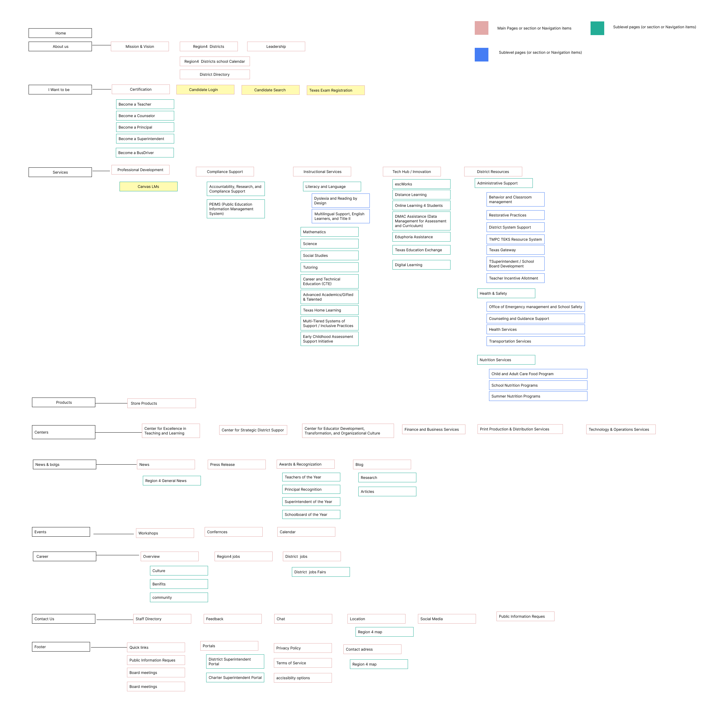
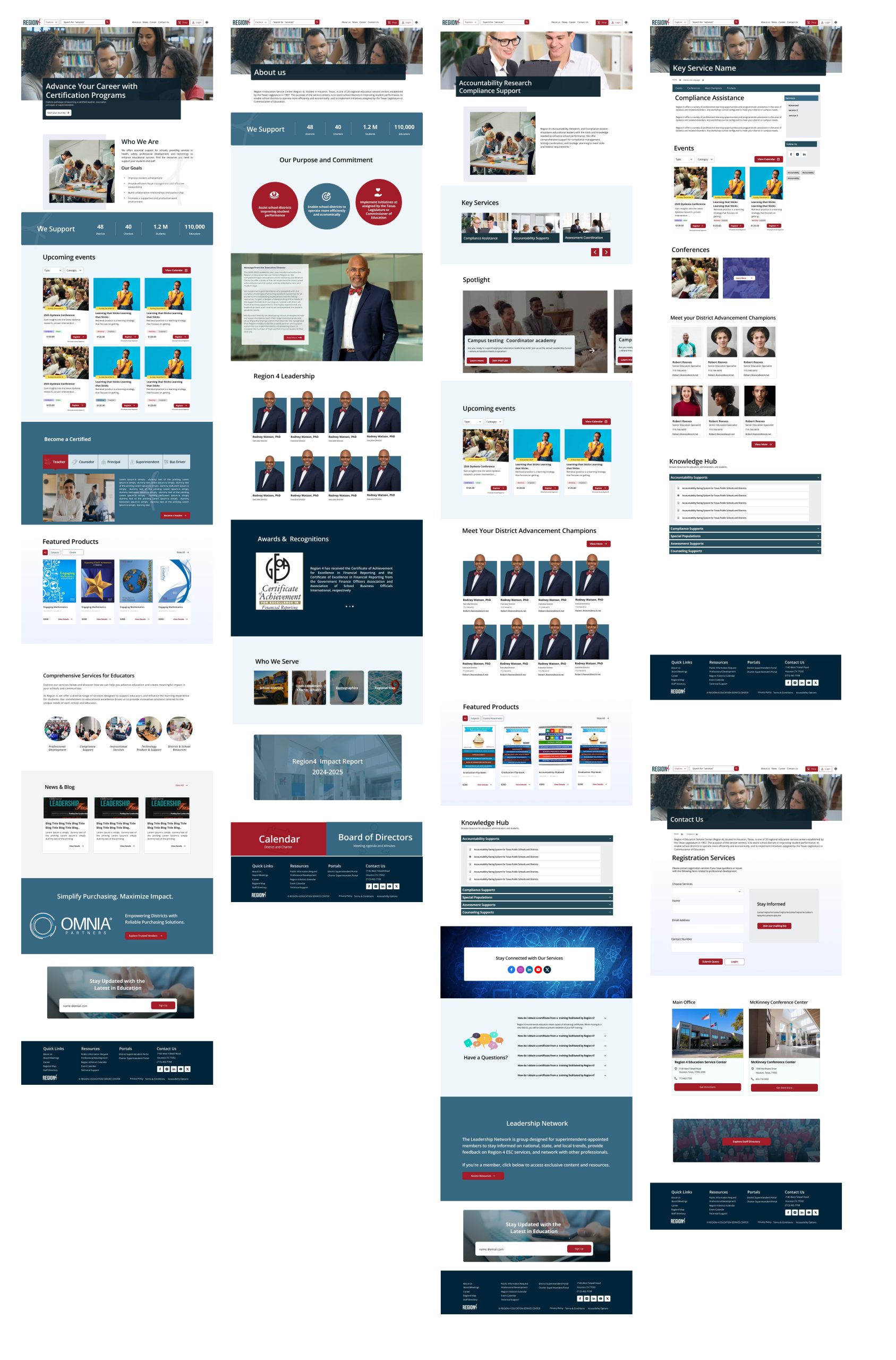
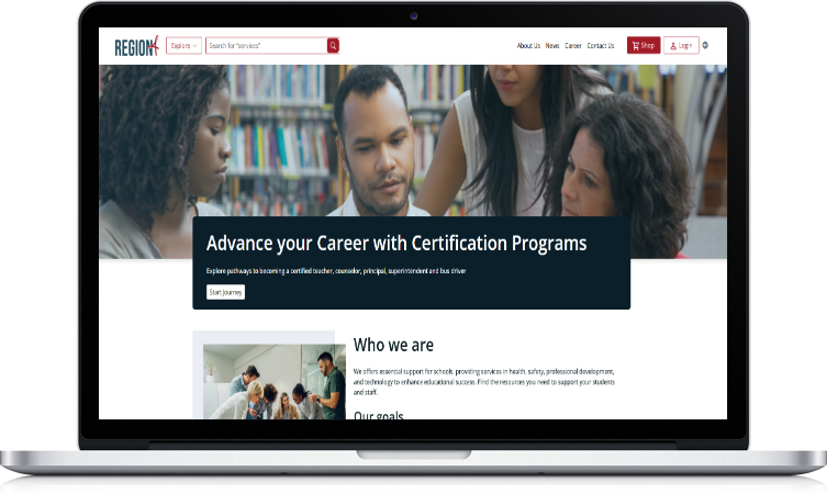
User Struggle with Finding Key Information.
Users struggled to locate Region 4’s services and understand its mission, leading to confusion and a frustrating user experience.

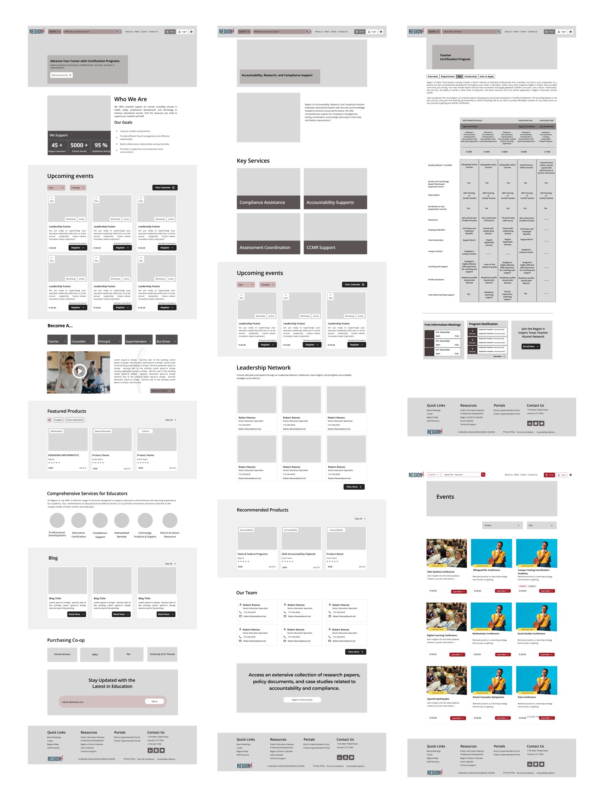
Missing Event Visibility and Registration Options.
The website lacks a clear section for upcoming events, along with essential details and an easy-to-access registration feature, making it difficult for users to stay informed or participate.

Missed Opportunities to Enroll in Desired Certification Courses.
Users are unable to easily discover and add certification courses to their cart, leading to frustration and potential loss of engagement or conversions.